

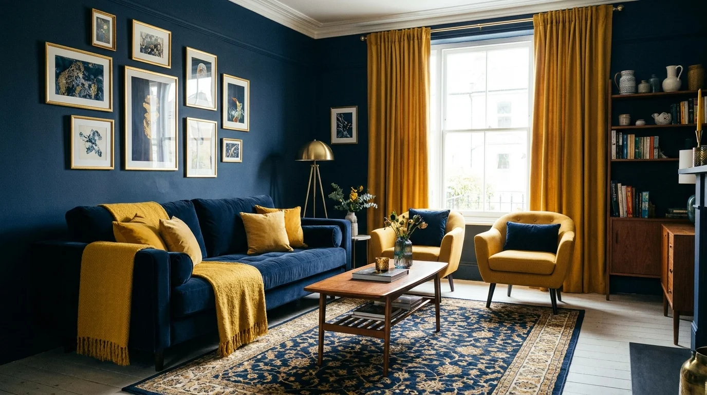
A living room’s color combination sets the mood before anyone sits down, from a calm, neutral backdrop to a bold pairing that makes the whole room feel considered. This article focuses specifically on living room palettes; for the whole-home version, see our guide to interior color schemes.
Below are nine living room color combinations that work with real sofas, rugs, and walls, plus the reasoning behind each pairing so you can adjust it to your own furniture and light. You’ll also find guidance on matching wall colors to your existing sofa and decor, mistakes to avoid, and how to test a combination before committing to paint.
How to Choose the Right Living Room Color Combination
Start with what’s already in the room before picking new colors.
Natural light and room size. A living room with limited natural light carries saturated colors differently than a bright, south-facing room. In smaller living rooms, reserve bold colors for one wall or a few accents rather than covering every surface, so the room doesn’t feel smaller still.
Existing furniture and flooring. Your sofa, rug, and flooring are usually the most expensive and least flexible pieces in the room. Choose wall and accent colors that work with what you already own, especially if you’re renting and can’t replace flooring or built-in finishes.
One dominant color, one or two supporting colors. A living room combination works best when one color leads, often the walls or a large upholstered piece, and the rest play a supporting role in rugs, cushions, curtains, or a single accent chair.
Balance vibrant shades with neutral surfaces. A saturated color like cobalt blue or burgundy reads as sophisticated next to white, cream, or warm wood. The same color surrounded by other bold tones can feel chaotic rather than curated.
Test samples under different lighting. Paint a sample patch and view it in morning, midday, and evening light, plus with your lamps on after dark, since living rooms are used at every hour of the day.
9 Vibrant Living Room Color Combinations to Try
Each pairing below names a base color, an accent, and how to apply both without redoing the whole room.
1. Navy Blue and Mustard Yellow
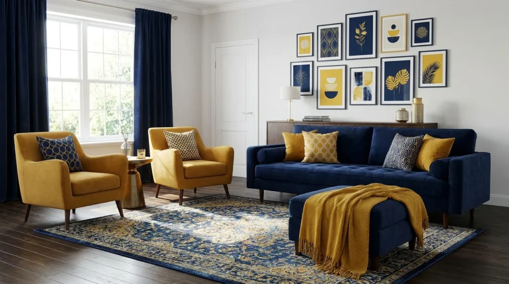
Navy works as the grounding base, on an accent wall or a large sofa, while mustard adds warmth as the accent, through cushions, a throw, artwork, or a single accent chair.
The combination feels bold and warm at once; navy keeps it grounded, and mustard keeps it from feeling cold or corporate. Pair it with warm wood furniture and brass or bronze lighting so the navy doesn’t read as cold, and keep mustard to two or three accents rather than curtains in a small room, where too much yellow can overwhelm.
2. Sage Green and Warm Beige
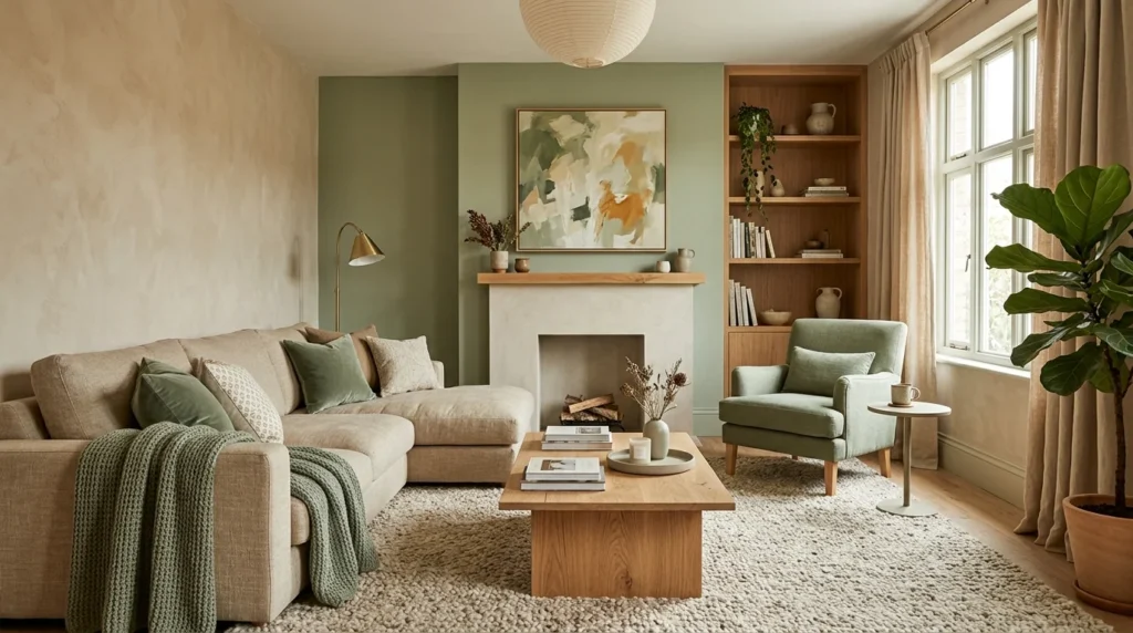
Warm beige covers the walls and large upholstery as the base, while sage green supports it on an accent wall, a rug, or curtains.
This pairing feels relaxed and nature-inspired. Sage works well on curtains or a jute-bordered rug, and adding a few actual plants ties the palette to real greenery instead of keeping it purely a wall color.
3. Terracotta and Cream
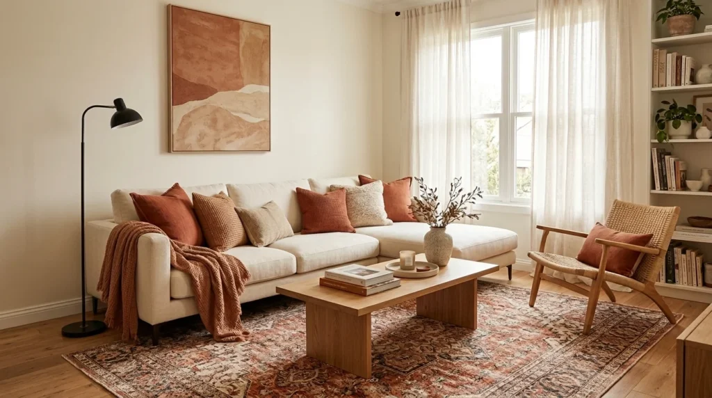
Cream covers the walls and sofa as the base, while terracotta adds warmth as the accent, in pillows, a throw, or ceramic accessories.
The cream keeps the look light rather than heavy. A terracotta accent chair or a patterned rug adds warmth without covering every surface; avoid pairing it with cool gray undertones elsewhere in the room, such as a blue-gray rug, since the mismatch reads as unplanned.
4. Teal and Warm White
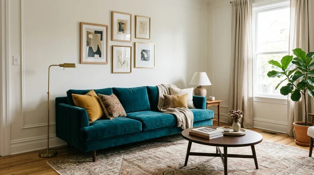
Warm white covers the walls and trim as the base, while teal is introduced through a sofa or a single accent wall.
The result feels fresh and a little dramatic without turning cold. A teal velvet sofa against white walls, or a teal accent wall behind a white sectional, both work; keep teal to one large element rather than spreading it across several small accessories, so it reads as a deliberate choice rather than scattered color.
5. Charcoal Gray and Blush Pink
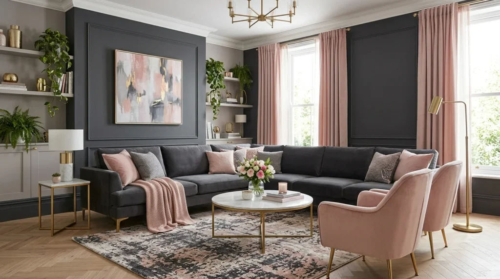
Charcoal provides the base, on a sofa, an accent wall, or a large rug, while blush softens it as the accent, through cushions, a throw, or lighter furniture.
The pairing feels moody but not heavy, thanks to the blush. A charcoal sectional with blush and cream cushions, or a charcoal accent wall with a blush armchair, both apply the combination well; in rooms with limited natural light, add at least one reflective surface, like a mirror or a glass side table, so the charcoal doesn’t make the space feel smaller.
6. Olive Green and Rust
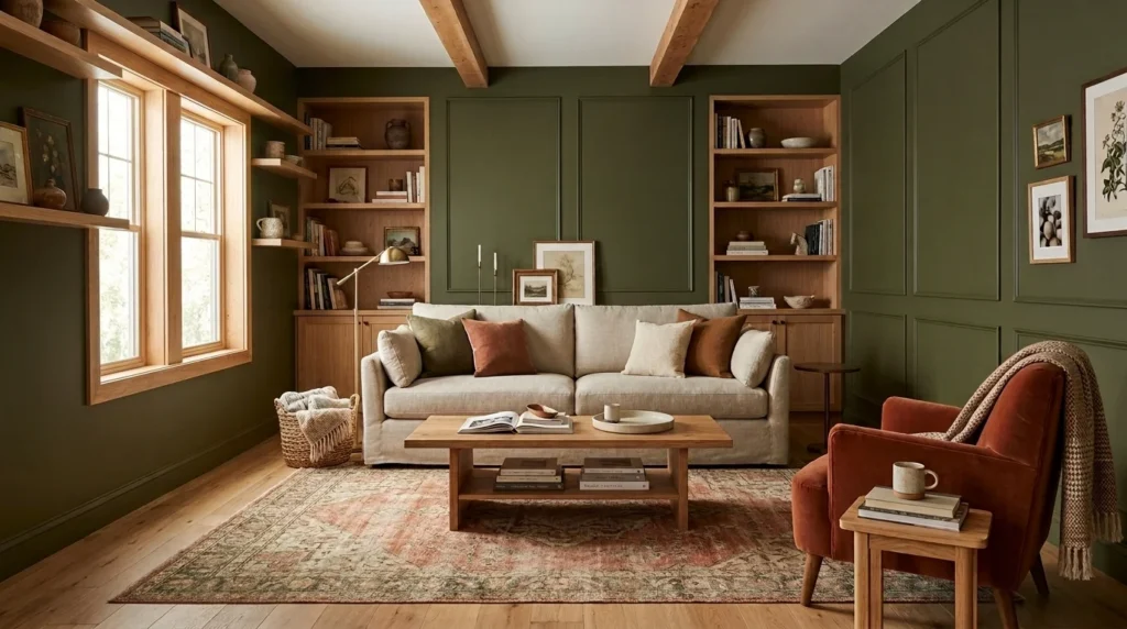
Olive green covers the walls or a large upholstered piece as the base, while rust appears as the accent, in cushions, a throw, or a single chair.
This combination feels earthy and grounded, and works well with natural materials: wood furniture, woven baskets, and textured fabrics like boucle or linen. It leans darker overall, so balance it with a light rug or pale flooring to keep the room from feeling closed in.
7. Cobalt Blue and Crisp White
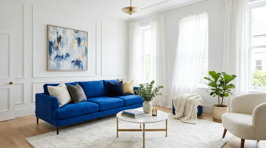
Crisp white covers the walls as the base, while cobalt becomes the focal color, on a sofa, an accent chair, or an accent wall.
The pairing is bold, graphic, and energizing. A cobalt sofa against white walls, or white walls with cobalt curtains and one matching cushion, both work; keep the rest of the room’s accessories neutral (black, white, natural wood) so cobalt stays the clear focal point instead of competing with other colors.
8. Lavender and Soft Gray
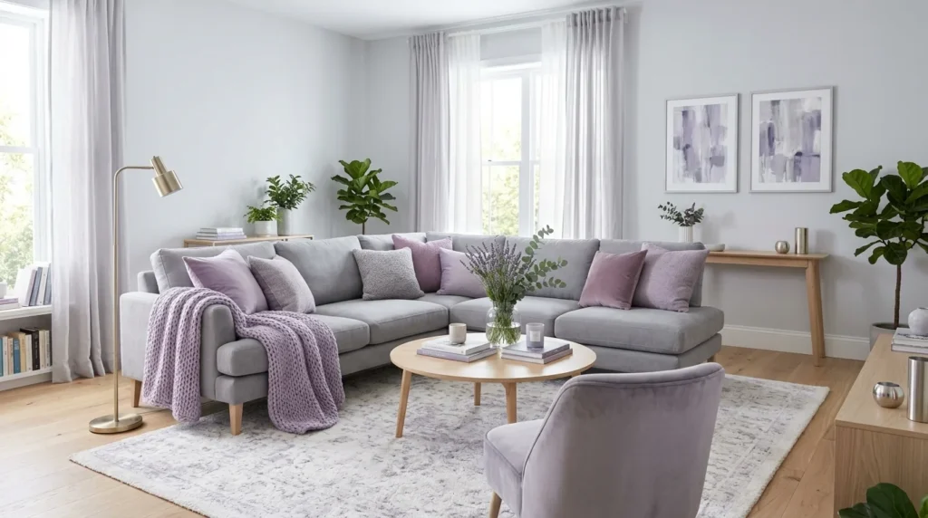
Soft gray covers the walls or sofa as the base, while lavender supports it as an accent, in cushions, curtains, or an accent chair.
The combination feels fresh, contemporary, and calm. Lavender curtains with a gray sofa, or a lavender accent chair against gray walls, both apply well; choose a muted, gray-toned lavender rather than a bright purple to keep the look from feeling overly sweet or themed.
9. Burgundy and Warm Taupe
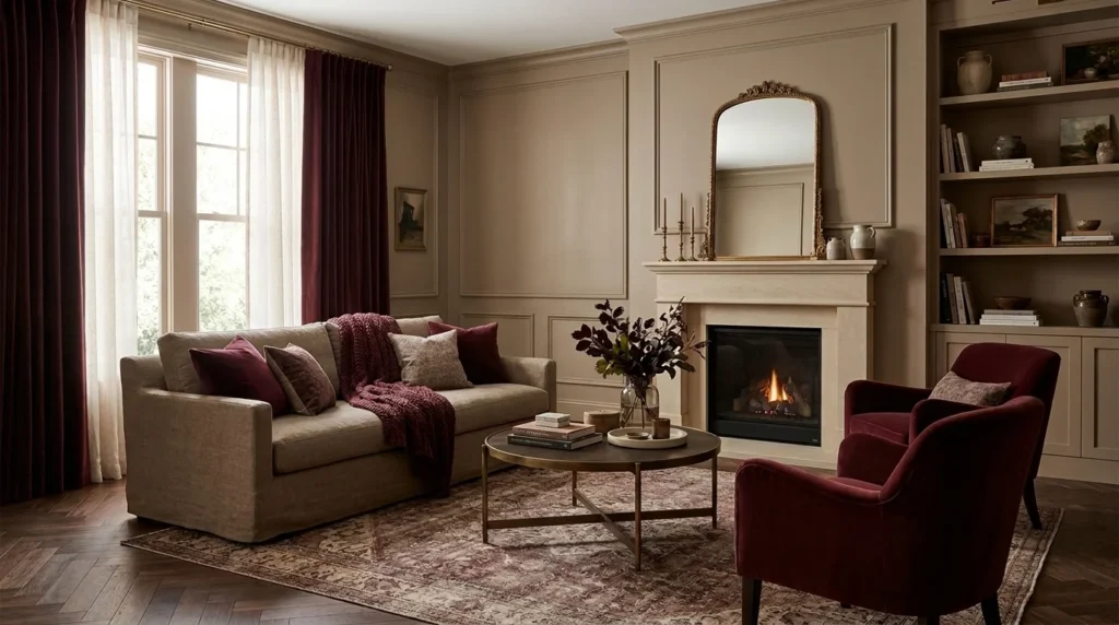
Warm taupe covers the walls and large furniture as the base, while burgundy appears in moderation as the accent, in a chair, curtains, or a patterned rug.
The result feels rich and layered, more formal than the other combinations here. A burgundy velvet accent chair against taupe walls, or taupe walls with burgundy curtains and a wood coffee table, both work; limit burgundy to one or two pieces since it’s the most saturated color in the pairing, and add natural wood to keep the room from feeling too formal for everyday use.
How to Match Wall Colors With Your Sofa and Decor
Start with your sofa, since it’s usually the largest and least flexible color choice in the room. Pick a wall color that complements its undertone rather than fighting it: a warm beige sofa pairs more easily with warm whites and terracottas than with cool blue-grays.
Use your rug and curtains to repeat the colors you’ve already chosen, rather than introducing new ones. A rug that pulls in both your wall color and your sofa color helps the room feel planned instead of assembled piece by piece.
Introduce accent colors through smaller, lower-cost items: cushions, a throw blanket, a vase, or framed art. This is especially useful for renters, since these pieces move with you and let you change the accent color without repainting or buying new furniture.
Avoid matching every item exactly. A sofa and rug in the identical shade of green can look flat; the same green in slightly different tones, finishes, or textures, velvet versus a woven wool rug, for example, reads as more intentional.
Once you’ve settled on a palette, our living room organization ideas cover arranging furniture and planning the layout around it.
Common Color-Matching Mistakes to Avoid
Using too many competing bold shades. Stick to one dominant color and one or two supporting colors from the combinations above. Adding a third or fourth bold shade usually looks chaotic rather than curated.
Ignoring undertones in paint and upholstery. A sofa with a cool gray undertone next to a wall with a warm beige undertone can look mismatched even if both colors seem neutral on their own. Check undertones side by side, not separately.
Choosing colors based only on online images. Screens display color differently depending on the device and the lighting in the photo. Always view a physical paint sample or fabric swatch in your own room before deciding.
Using dark colors without considering lighting. Charcoal, navy, and burgundy can look sophisticated in a bright room and heavy in a dim one. Test dark colors in your room’s actual light, not just in a showroom.
Repainting before checking how new colors work with existing finishes. Hold your paint sample next to your sofa, rug, and flooring before committing. Repainting a wall that clashes with furniture you’re keeping means paying for the work twice.
Frequently Asked Questions
What are the best color combinations for a living room?
There’s no single best combination; it depends on your room’s light, existing furniture, and personal style. The nine pairings above, such as sage green and warm beige or navy and mustard, are reliable starting points you can adjust.
How many colors should a living room have?
Most living rooms work well with two to three colors: a dominant color, a supporting color, and an accent. Textures and patterns can add visual interest without adding more colors to the mix.
What colors make a living room feel warm and inviting?
Warm neutrals like beige and cream, earthy tones like terracotta and olive, and warm accent colors like mustard or rust tend to read as inviting, especially when paired with natural wood and soft textiles.
How do you choose wall colors to match a sofa?
Identify your sofa’s undertone first, warm or cool, then choose a wall color within the same family. A warm beige sofa suits warm whites and terracottas, while a cool gray sofa suits soft blues or cooler grays.
Should living room walls and furniture be the same color?
Not usually. A single dominant color on both walls and a large sofa can feel flat. Varying the tone, finish, or texture between the two, even within the same color family, creates more visual depth.
Conclusion
The right living room color combination depends on your room’s light, your existing sofa and rug, and how formal or relaxed you want the space to feel. Use the nine pairings above as a starting point, apply them through walls, upholstery, and smaller accessories, and test physical samples in your own lighting before committing to paint.





Leave a Reply