

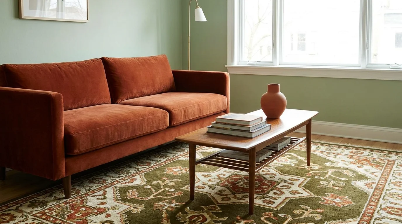
The right interior color scheme does more than decorate a room; it ties flooring, furniture, and trim into one coherent look instead of a string of disconnected choices. Below are seven interior color schemes that work in real homes, along with the reasoning behind each pairing so you can adapt them rather than copy them exactly.
You’ll also find a framework for choosing a palette, testing it before you commit, and carrying it from room to room without every space looking identical.
How to Choose an Interior Color Scheme
Before picking colors, look at what’s already fixed in the room. These elements are harder to change than paint, so the palette should work around them, not the other way around.
Light and orientation. North-facing rooms get cooler, flatter light and tend to suit warmer colors that keep the space from feeling dim. South- and west-facing rooms get warmer, stronger light and can carry cooler tones without feeling cold.
Flooring, furniture, and fixed finishes. Note the undertones already in the room: wood flooring, stone countertops, tile, and large furniture pieces. A new color scheme should complement these rather than fight them, since they’re typically the most expensive and least flexible elements in the room.
Dominant, supporting, and accent colors. Most successful schemes use three roles: a dominant neutral that covers most of the walls, a supporting color on cabinetry, upholstery, or a secondary wall, and an accent used sparingly in art, textiles, or hardware.
Warm versus cool undertones. Warm colors (reds, oranges, yellows, and warm neutrals like beige or cream) tend to feel cozy and work well with wood tones. Cool colors (blues, greens, and grays with blue undertones) feel calmer and pair naturally with metals like chrome or brushed nickel. Mixing undertones isn’t off-limits, but it’s easier to get a cohesive look by starting within one family.
The 60-30-10 rule. This is a flexible starting ratio, not a strict formula: about 60% of the room in the dominant color (walls and large surfaces), 30% in the supporting color (furniture, cabinetry, a secondary wall), and 10% in accents (pillows, art, hardware). Adjust the proportions to fit the room. A small powder room, for example, can handle a bolder ratio than a large open-concept living space.
7 Interior Color Schemes to Transform Your Home
Each palette below pairs a dominant neutral with one or two supporting colors. Use the color roles and lighting guidance above to adapt the proportions to your own room.
1. Warm White, Beige and Natural Wood
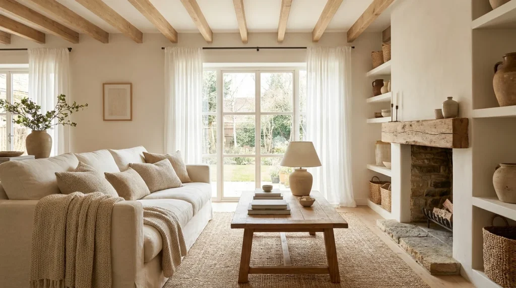
A warm white (an off-white with a yellow or red undertone) works as the dominant wall color, beige carries through in upholstery and textiles, and natural wood (oak or ash) anchors the room in furniture or flooring.
This combination works because every element shares a warm undertone, so nothing clashes, and the wood keeps the palette from feeling flat or sterile. It suits living rooms see our living room color combinations guide for more, entryways, primary bedrooms, and open-concept great rooms.
Pair it with linen or boucle upholstery, a jute or wool rug, and rattan accents. Vary the texture across pieces since the colors themselves are close in tone, and add one dark element, such as black hardware, a charcoal lamp, or a dark wood console, so the room has an anchor instead of reading as washed out.
2. Sage Green, Cream and Warm Wood
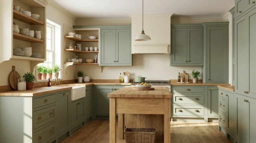
Sage green sits close enough to neutral that it functions like a wall or cabinet color rather than a bold statement, cream softens it on trim or the ceiling, and warm-toned wood ties it to the floor or furniture.
Because sage is desaturated, it pairs easily with wood without competing for attention. This scheme works well on kitchen cabinetry, in bedrooms, and in home offices.
Finish with brass or aged bronze fixtures, woven baskets, and linen curtains. If you’re testing the look for the first time, apply sage to one wall or a bank of cabinets rather than committing to a full room, and use wood with a warm, not gray, undertone to avoid a cold mismatch.
3. Navy Blue, Soft White and Brass Accents
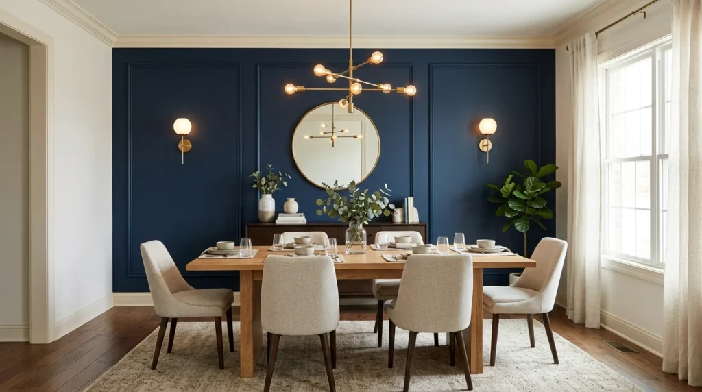
Navy functions as an anchor color, used on an accent wall, built-ins, or a kitchen island, while soft white covers the remaining walls and trim, and brass adds warmth through hardware and lighting.
Navy reads as dramatic without feeling like a typical accent color because of its depth, and brass keeps the combination from feeling cold or corporate. It suits dining rooms see our dining room color palette guide for ideas, home offices, kitchen islands, and powder rooms.
Add brass sconces or cabinet pulls, a countertop with warm veining, and velvet or linen upholstery. In smaller rooms, keep navy below eye level, on an island or wainscoting, so the ceiling stays light and the room doesn’t feel shorter.
4. Terracotta, Sand and Olive Green
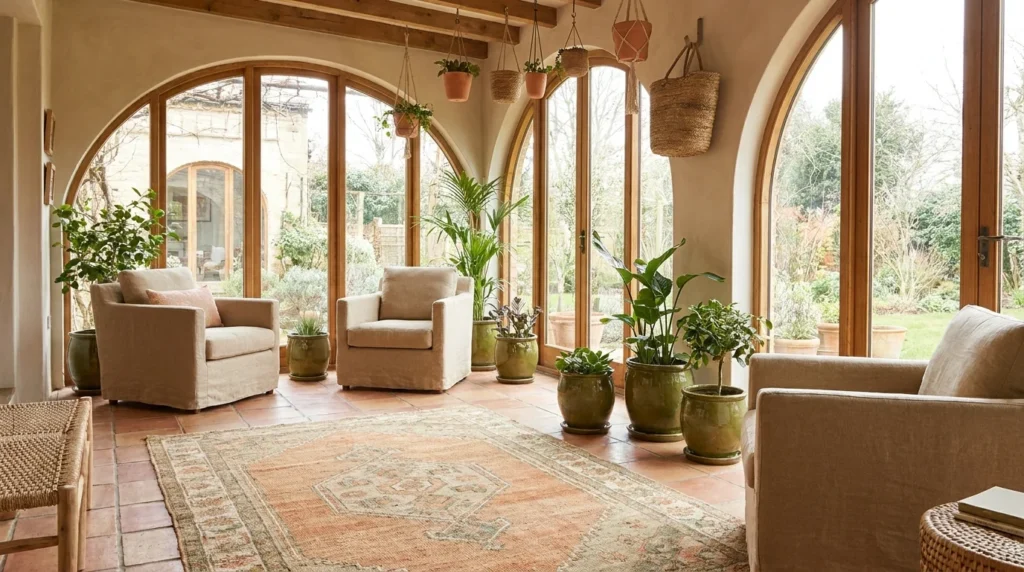
Sand works as the dominant wall color, terracotta appears as an accent in pillows, art, or a single wall, and olive green shows up in cabinetry, textiles, or plants.
All three are muted, earthy tones with similar warmth and saturation, which is why they sit together without one overpowering the others. This palette suits dining rooms, sunrooms, kitchens, and entryways, particularly homes with good natural light.
Bring in unglazed terracotta tile or pots, rattan furniture, and matte black or aged iron fixtures. Let sand dominate and keep terracotta and olive to smaller moments; using all three in equal, saturated doses can read dated fast.
5. Charcoal Gray, Warm White and Natural Oak
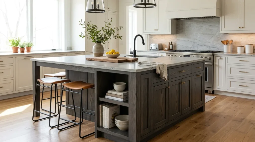
Charcoal gray takes cabinetry, an accent wall, or a furniture piece, warm white covers the remaining walls, and natural oak carries the warmth through flooring or furniture.
Charcoal adds contrast without the starkness of black, oak keeps it from feeling heavy, and warm white (not a stark, cool white) ties the two together. This scheme works in kitchens, living rooms, and home offices, especially ones with strong natural light.
Pair it with brushed brass or warm bronze hardware and leather or boucle upholstery. In rooms with limited natural light, use charcoal below eye level, on lower cabinets or an island, rather than on all four walls, and choose pale rather than dark-stained oak to keep the room from feeling closed in.
6. Dusty Blue, Soft Gray and Cream
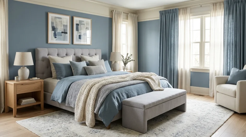
Dusty, muted blue takes the main role on walls or cabinetry, soft warm gray covers trim or a secondary wall, and cream shows up in textiles and the ceiling.
Because the blue is desaturated, it functions closer to a neutral than a bold color, and cream keeps the cooler tones from feeling cold. This palette suits bedrooms, bathrooms, nurseries, and home offices.
Add brushed nickel or warm pewter fixtures, oak or ash wood accents, and linen bedding or drapery. Choose a blue with a gray undertone rather than a bright or true blue to keep the room calm, and include at least one warm wood element so the palette doesn’t feel sterile.
7. Blush, Taupe and Muted Burgundy
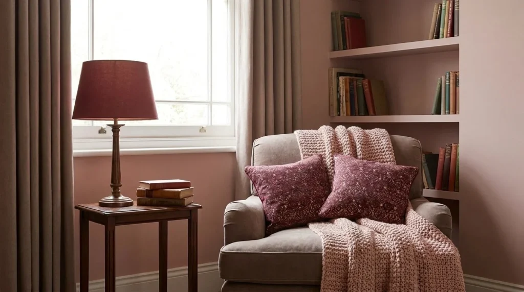
Taupe serves as the dominant neutral, blush adds a soft secondary accent, and muted burgundy (not a bright red) provides depth in a smaller dose.
Taupe and blush share a similar warm undertone, so they blend rather than contrast, while burgundy keeps the combination from reading as too soft or pastel. This palette works well in primary bedrooms, powder rooms, reading nooks, and dining rooms.
Use velvet upholstery, brushed brass or aged gold fixtures, and warm wood furniture; walnut pairs especially well. Limit burgundy to one or two pieces, such as a chair or drapery, since it carries the most saturation of the three; this palette leans formal, so keep furniture lines simple if the room is small.
How to Use One Color Scheme Throughout Your Home
A palette doesn’t need to repeat identically in every room to feel coordinated; it needs a consistent thread running through connected spaces.
Pick one base or neutral color and carry it through adjoining rooms, either as the exact same shade or a close variation. Repeat your accent colors in small doses as you move between spaces, such as a pillow in one room and a piece of art in the next, rather than introducing a new accent color in every doorway.
Adjust intensity by function and light. A bedroom can handle a quieter, more muted version of a palette than a kitchen or living room built for activity and entertaining. In open-concept layouts, keep the base color consistent across the whole space, but let accent colors shift subtly from the kitchen to the dining area to the living room so each zone still reads as distinct.
Common Interior Color Scheme Mistakes to Avoid
Choosing paint before flooring and furniture. Flooring and large furniture pieces are expensive and slow to change. Match paint to what’s already fixed in the room, not the other way around.
Using too many competing accent colors. More than one or two accent colors on top of a dominant and supporting color usually reads as cluttered rather than intentional. The 60-30-10 ratio above is a useful check.
Ignoring the difference between daylight and artificial light. A color that looks warm and inviting in daylight can turn muddy under evening lighting, or the reverse. Test colors under both before committing.
Assuming the same paint looks identical in every room. Window size, wall orientation, and neighboring colors all change how a shade reads, so a color that works in one room may look noticeably different in another, even with identical paint.
Selecting colors from a screen or a small chip. Screens and tiny paint chips don’t reflect how a color behaves at full scale under your room’s actual light. Test physical samples before buying full cans.
How to Test Your Color Palette Before Painting
Paint larger sample swatches (a roughly two-foot square, not a small chip) on more than one wall where practical, since different walls catch different light throughout the day.
Check the samples in the morning, midday, and evening, and again with your artificial lighting on after dark. Hold the samples next to existing flooring, furniture, and trim rather than judging them in isolation.
Bulb temperature matters as much as the paint itself: warm white LEDs can shift a cool gray toward green, while cool white bulbs can make a warm beige look dull. Test under the bulbs you actually use in that room, not a showroom’s lighting.
Frequently Asked Questions
What is the best color scheme for a home interior?
There’s no single best scheme. It depends on your home’s natural light, existing finishes, and personal taste. A reliable starting point is picking one neutral base and layering in no more than two supporting colors using the 60-30-10 approach above.
How many colors should you use in a room?
Most rooms work well with three: a dominant neutral covering roughly 60% of the space, a secondary color around 30%, and an accent around 10%. Beyond that, a room risks looking unplanned, though textures and patterns can add visual interest without adding more colors.
How do you choose colors that work together?
Start with undertones. Warm tones (yellow, red, orange) generally pair best with other warm tones, and cool tones (blue, green, purple) pair best together. A common mismatch is a warm wood floor paired with a cool-toned gray wall. Aligning undertones first makes most color combinations easier to coordinate.
Should every room in a house have the same color scheme?
Not identical, but coordinated. Repeating the same base neutral across connected spaces while varying the accent colors room to room creates flow without every space looking the same, which is especially useful in open floor plans.
What colors make a home feel warm and inviting?
Warm neutrals (beige, warm white, taupe), earthy tones (terracotta, olive, sand), and natural materials like wood tend to read as inviting because they reflect warm light. Cooler palettes can feel just as welcoming when balanced with warm wood or metal accents, as in the dusty blue and charcoal schemes above.
Conclusion
The best interior color scheme is the one that works with your home’s natural light, existing finishes, and how you actually use each room, not a trend borrowed wholesale from a photo. Use the seven palettes above as starting points, adjust the proportions with the 60-30-10 rule, and test physical samples under your own lighting before you commit to paint.





Leave a Reply