

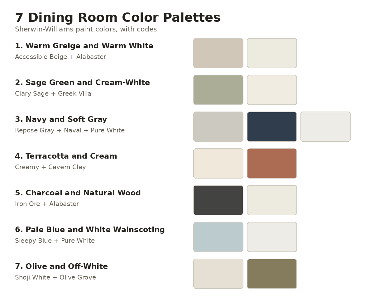
The best dining room color palette uses one main wall color, a lighter trim color, and one accent, split roughly 60/30/10. Below are seven combinations built from real Sherwin-Williams paints, each with its color code, its light reflectance value (LRV), and the type of dining room it suits. Pick a light warm neutral for a small room, a mid-tone green or blue for a room with good daylight, and a dark navy or charcoal only if you can add warm lighting.
Dining rooms are used mostly in the evening, so the color has to work under a chandelier as well as in daylight. For broader color theory, read our guide to interior color schemes, and for a room built for lounging instead of dining, see our living room color combinations.
The 7 Palettes at a Glance
| Palette | Main paint | Second paint | Best for | Mood |
|---|---|---|---|---|
| 1. Warm greige and warm white | Accessible Beige SW 7036 | Alabaster SW 7008 | Small or enclosed rooms | Calm, flexible |
| 2. Sage green and cream-white | Clary Sage SW 6178 | Greek Villa SW 7551 | Rooms with daylight and light wood | Fresh, natural |
| 3. Navy and soft gray | Repose Gray SW 7015 | Naval SW 6244 | Formal rooms with a sideboard wall | Formal, polished |
| 4. Terracotta and cream | Creamy SW 7012 | Cavern Clay SW 7701 | Everyday family meals | Warm, welcoming |
| 5. Charcoal and natural wood | Iron Ore SW 7069 | Alabaster SW 7008 (ceiling) | Evening dinners with warm lighting | Dramatic, moody |
| 6. Pale blue and white wainscoting | Sleepy Blue SW 6225 | Pure White SW 7005 | Traditional and farmhouse rooms | Light, classic |
| 7. Olive and off-white | Shoji White SW 7042 | Olive Grove SW 7734 | Rooms with a hutch or built-in | Earthy, grounded |
LRV measures how much light a paint reflects, from 0 for black to 100 for pure white. As a rule of thumb, paints above 60 bounce light around a room and paints below 20 absorb most of it. Every color below is from Sherwin-Williams, so you can take the code to any Sherwin-Williams store. The hex codes in the swatch images are screen approximations, so sample the real paint before you buy.
7 Dining Room Color Palettes With Paint Colors
1. Warm Greige and Warm White
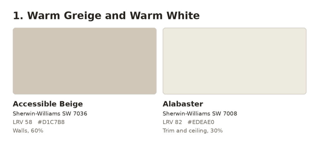
Paint the walls Accessible Beige (SW 7036, LRV 58) and the trim, ceiling, and any wainscoting Alabaster (SW 7008, LRV 82). Accessible Beige is a warm greige, so it reads as neutral without turning cold in the evening. Use it on about 60% of the surfaces and Alabaster on about 30%, then add the last 10% in wood, linen, and woven textures.
This palette suits small, enclosed dining rooms and rentals, because both paints sit above LRV 55 and keep the room bright. It works with walnut, oak, and painted tables without a clash. Skip it if you want visible color. On its own it can look flat, so plan for texture: a jute or wool rug, linen napkins, and a wood table with visible grain.
2. Sage Green and Cream-White
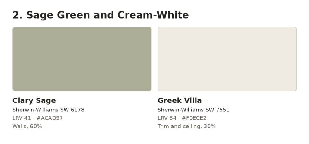
Use Clary Sage (SW 6178, LRV 41) on the walls and Greek Villa (SW 7551, LRV 84) on the trim and ceiling. Clary Sage is a gray-green with a yellow undertone, which keeps it from turning blue under warm bulbs. Walls take about 60%, trim and ceiling about 30%, and brass, oak, and plants make up the last 10%.
It works best with light wood tables and chairs, and in rooms that get daylight. In a north-facing room with little sun, a gray-green like this reads cooler and flatter, so test it at night before you commit. Skip it if your dining room faces north and has only one small window.
3. Navy and Soft Gray
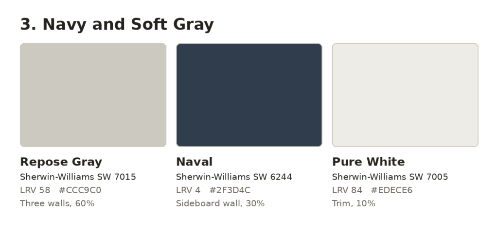
Paint three walls Repose Gray (SW 7015, LRV 58) and the wall behind your sideboard or built-in Naval (SW 6244, LRV 4). Use Pure White (SW 7005, LRV 84) on the trim. Repose Gray is a soft, warm gray, so it supports the navy without making the room feel cold. The grays take about 60%, Naval about 30%, and the white trim about 10%.
Naval reflects only about 4% of the light that hits it, so keep it to one wall or one built-in unless the room has large windows. A brass or aged-metal chandelier and 2700K bulbs bring the warmth back. This palette suits formal dining rooms and tables in light or medium wood. Skip it for a small room with a single window.
4. Terracotta and Cream
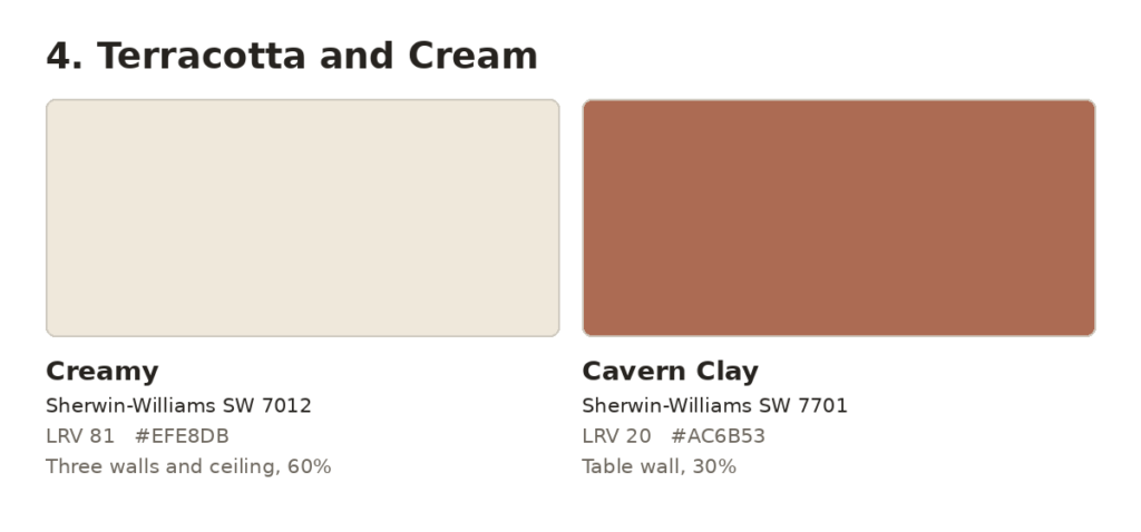
Paint three walls and the ceiling Creamy (SW 7012, LRV 81) and one wall Cavern Clay (SW 7701, LRV 20), usually the wall behind the table. Creamy covers about 60% of the surfaces and Cavern Clay about 30%. Cushions, a table runner, and wood finishes make up the last 10%.
Cavern Clay is a clay red-brown, and it looks warmest under 2700K bulbs and next to wood furniture. Keep it to one wall, because four walls at LRV 20 would darken a small room noticeably. This palette suits family dining rooms used every day. Skip it if your furniture is cherry or mahogany, since the reds will compete with the wall.
5. Charcoal and Natural Wood
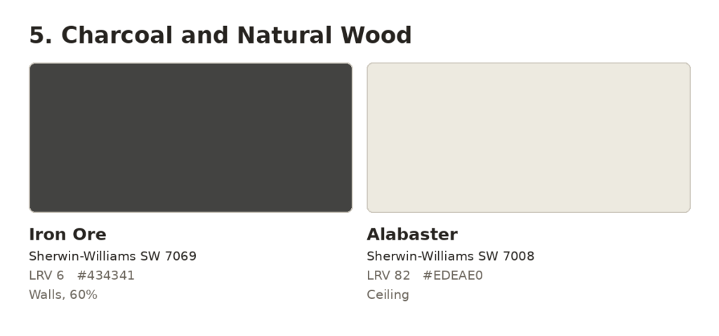
Paint the walls Iron Ore (SW 7069, LRV 6) in a matte or eggshell finish and the ceiling Alabaster (SW 7008, LRV 82). The light ceiling keeps the room from feeling like a box. Iron Ore covers about 60% of the surfaces, natural wood in the table, chairs, and floor about 30%, and brass or matte black fixtures about 10%.
Iron Ore is a soft black with a slightly warm cast, and it makes oak, walnut, and ash look richer by contrast. It suits dining rooms used mostly for dinner, especially with a dimmer and candlelight. Skip it if the room has little natural light and you also eat breakfast there, because at LRV 6 the room will feel dim in the morning.
6. Pale Blue and White Wainscoting
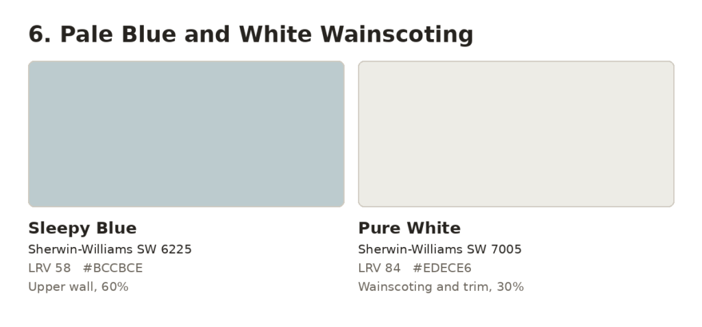
Install wainscoting or a chair rail about one third of the way up the wall. Paint below it Pure White (SW 7005, LRV 84) in satin, and paint above it Sleepy Blue (SW 6225, LRV 58). Sleepy Blue covers about 60% of the surfaces, the white about 30%, and warm wood and brass about 10%.
Sleepy Blue is a pale gray-blue, light enough to keep a small room open. It suits traditional and farmhouse dining rooms and works with oak, maple, and white-painted tables. Skip it if the room faces north with little sun, because pale blues look colder there. Palette 1 is the warmer choice for that room.
7. Olive and Off-White
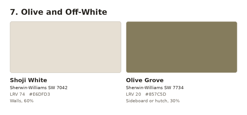
Paint the walls Shoji White (SW 7042, LRV 74) and the sideboard, hutch, or built-in Olive Grove (SW 7734, LRV 20). Shoji White covers about 60% of the surfaces and Olive Grove about 30%. Brass hardware, dark wood, and ceramics make up the last 10%.
Olive Grove is a warm, gray-leaning olive. It looks best with dark wood, aged brass, and vintage or eclectic furniture. It is also the easiest dark color on this list to use in moderation, because it stays on the furniture instead of covering the walls. Skip it for a modern all-white room with cool white fixtures, where the olive’s warmth will clash.
How to Choose Your Dining Room Color Palette in 5 Steps
- Read your table’s undertone. Hold a sheet of plain white paper next to the wood. If the wood looks yellow, orange, or red against the paper, choose a warm palette such as 1, 4, or 7. If it looks gray or ashy, the cooler palettes 3 and 6 work better.
- Note which way the main window faces. North-facing rooms get cool, even light, so choose a paint with an LRV above 55 or a warm undertone. South-facing rooms get warmer light and handle cooler colors and darker paints better.
- Check how the room connects. If the dining area is open to the kitchen or living room, keep the same undertone as the neighboring walls. A closed dining room can take its own color.
- Choose a palette and divide the surfaces 60/30/10. Decide the walls first, then the trim and ceiling or the furniture, and the accent last.
- Test before you buy gallons. Put a 12 by 12 inch sample on two walls (peel-and-stick samples work), and look at them in the morning, in the afternoon, and at dinner time with the dimmer set where you usually keep it. Judge the color after a full day, not in the first hour.
How to Coordinate Walls, Furniture, and Decor
Let the table and chairs lead, because they cost the most and are the hardest to change. Match undertones, not exact colors. A warm walnut table works with warm greige or cream, and a gray-brown or ash table works with soft blue or cool gray.
Repeat the accent color in small items such as a table runner, chair cushions, art, or a ceramic bowl. Two or three repeats tie the room together without making the accent dominate.
If you have a dark brown hutch or built-in, treat it the way you would dark brown kitchen cabinets and choose walls that share its undertone. Our list of wall colors that complement dark brown cabinets covers specific paints for that situation.
Avoid matching the walls, table, and chairs in one tone. Vary at least one surface by a few shades or by finish, such as a wall lighter than the table, or chairs in a different wood than the table.
Paint Finish and Lighting for Dining Rooms
Use eggshell or matte on the walls, satin or semi-gloss on wainscoting and trim, and flat white on the ceiling. Matte hides wall flaws and softens candlelight, and satin trim wipes clean after spills.
Choose bulbs rated 2700K, which give warm light, and put the chandelier on a dimmer. Cool 4000K bulbs make greige and cream look gray and can flatten terracotta. Match the fixture’s metal to the palette: brass and aged bronze with warm colors, nickel or black with cool ones.
Dining Room Color Mistakes to Avoid
Judging color in daylight only. Dining rooms are used at night. A color that looks right at noon can turn gray or muddy under a chandelier, so test your samples with the evening lights on.
Using a dark color on every wall of a small room. Paints below LRV 20, such as Naval and Iron Ore, reflect very little light. Use them on one wall or in a larger room, and keep the ceiling light.
Ignoring the table’s undertone. A cool gray wall beside a red-toned table makes the wood look more orange. Do the white-paper check from Step 1 before you choose.
Leaving old trim as it is. Yellowed white trim beside fresh paint makes both look off. Repaint the trim in your palette’s white.
Choosing the light fixture after the paint. A brass chandelier warms a navy wall, while chrome can make the same wall feel cold. Pick the fixture finish at the same time as the color.
Frequently Asked Questions
What color should I paint a dining room ceiling?
Use flat white or the white from your palette. With dark walls such as Iron Ore, choose a lighter ceiling such as Alabaster (SW 7008) so the ceiling reflects light back into the room.
Should the dining room match the kitchen and living room?
Not exactly. In an open plan, share an undertone (warm with warm, cool with cool), but each space can use a different depth of color. A closed dining room can use its own palette.
Can I use a dark color in a small dining room?
Yes, if you mostly eat there at night. Use a matte finish, a light ceiling, and warm 2700K bulbs. Avoid it if the room has one small window and you also use it in the morning.
How much paint do I need for a dining room?
A 12 by 12 foot room with 8-foot ceilings has about 384 square feet of wall before you subtract doors and windows. A gallon covers about 350 to 400 square feet, so plan on two gallons for two coats.
Conclusion
Start with the light in your room, not the color you like in a photo. Small or north-facing rooms do best with Palette 1 or 6, rooms with daylight and light wood suit Palette 2, and rooms with a hutch suit Palette 7. Palette 4 fits family meals, and Palettes 3 and 5 suit dinners under warm light. Buy samples for your top two, test them at dinner time, and paint the winner.




Leave a Reply