

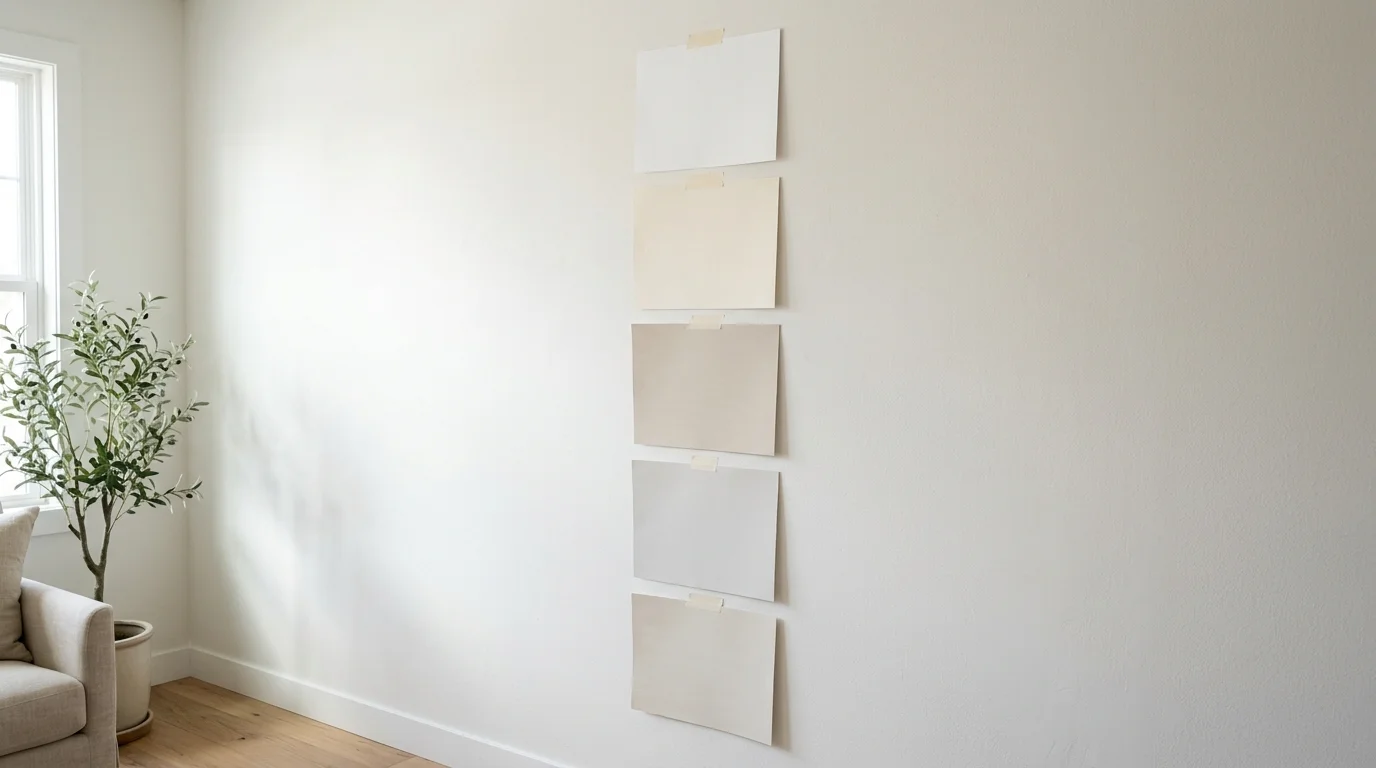
You hold a small paint chip up in the store and it looks like the soft, clean shade you have wanted for months. Then it goes on the wall and turns yellow in the afternoon, gray at night, or faintly pink next to the floor. This happens a lot with light colors, and it is not bad luck. Light shades carry very little pigment, so small differences in undertone, daylight, and nearby materials show up fast. A deep navy hides those shifts. A pale cream does not.
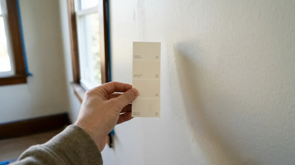
The good news is that you can predict most of these changes before you buy a gallon. This guide explains how light reflectance value works, how to read undertones, how window direction and light bulbs change the result, and how to test samples so you can commit with confidence.
What Counts as a Light Paint Color?
A light paint color is any shade that reflects a large share of the light that hits it. That includes true whites, creamy off-whites, pale grays, soft greige, light blues, gentle sage tints, and blush tones. The group is wide, which is why choosing from it can feel confusing.
Understanding Light Reflectance Value (LRV)
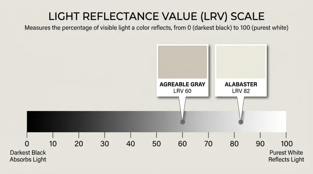
Light reflectance value, or LRV, is a number from 0 to 100 that shows how much light a color bounces back into the room. Pure black sits at 0, and a perfect reflector would sit at 100. Real paints never reach either end. Most light paint colors fall somewhere between about 60 and 90.
You can find the LRV on the back of many paint chips or on the manufacturer’s website. It is a handy way to compare two colors that look alike on a chip. Sherwin-Williams lists Alabaster at an LRV of 82 and Agreeable Gray at 60. Both are popular light colors, yet one is clearly brighter than the other.
Why a Higher LRV Is Not Always Better
It is tempting to pick the highest number you can find, but a very high LRV can work against you. In a room with strong direct sun, a bright white can feel harsh and make glare more noticeable. In a dark room, a high LRV helps, but it cannot create light that is not there. LRV tells you how much light a color returns. It does not tell you how the color will feel. Treat it as one clue, then judge the rest by eye.
Start With Undertones, Not the Color Name
Every light color carries a hidden base tone. Warm undertones lean toward yellow, red, or orange. Cool undertones lean toward blue, green, or violet. Neutral undertones sit in between. The undertone is what makes a white look creamy or crisp, and what makes a gray look soft or icy. Names like “white” or “greige” tell you very little, because two paints in the same category can have very different undertones.
Choosing the right undertone is also important when creating a cohesive home palette. Explore these interior color schemes to see how warm and cool shades work together across different rooms.
How to Spot an Undertone
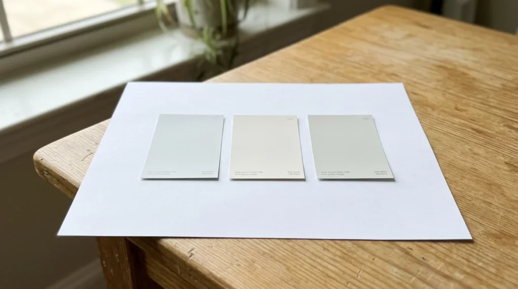
Hold the chip against a plain sheet of white printer paper in daylight. The paper gives your eye a clean reference, and the tint in the paint becomes easier to see. Then place the chip beside two or three others from the same color family. A gray that looks neutral on its own may suddenly show a green or lavender cast next to its neighbors. Side-by-side comparison is the fastest way to read an undertone.
Common Undertone Problems
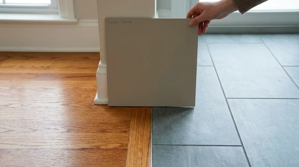
Cool grays can turn blue or lavender in a room that gets cool daylight. Beiges can look pink or orange beside certain wood floors. A warm white can look yellow next to cool gray tile or a stark white countertop. In each case the paint did not change. Its surroundings did, and they pulled the hidden tone forward.
How Natural Light Changes Your Paint

Daylight shifts through the day and through the seasons, and light colors show those shifts more than darker ones. In the Northern Hemisphere, which includes the United States, the direction a window faces is the biggest factor.
North-Facing Rooms
North-facing rooms get softer, cooler, and more even light. That can make cool grays and stark whites feel flat or chilly. Warm-leaning light colors, such as creamy whites and soft greige, usually balance the cool light.
South-Facing Rooms
South-facing rooms get the most light, and it is warm for much of the day. Nearly any light color looks good here, although very yellow creams can start to feel heavy by afternoon. A slightly cooler white often looks fresh instead of cold in a south-facing room.
East-Facing Rooms
East-facing rooms are bright and warm in the morning, then turn softer and cooler later in the day. A color that glows at breakfast may look much quieter by dinner, so check it at both times.
West-Facing Rooms
West-facing rooms stay calmer in the morning and fill with warm, golden light in the late afternoon and evening. That glow can push warm colors toward yellow or orange, so look closely at undertones before you commit. If you are not sure which way a room faces, open the compass app on your phone and stand at the window.
Do Not Forget Artificial Light
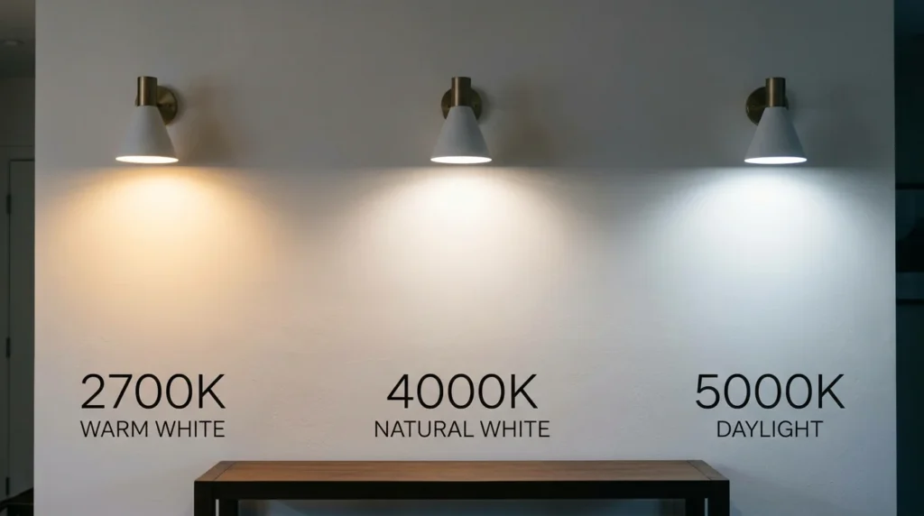
Most people see their rooms under lamps and ceiling lights for several hours every day, so artificial light matters as much as the sun. Bulb color is measured in Kelvin. Bulbs around 2700K to 3000K give a warm, yellow-leaning light. Around 4000K the light looks neutral. Around 5000K it looks like daylight and has a slightly blue edge. Warm bulbs push paint warmer, and daylight bulbs make the same paint look cooler.
For the most accurate color, look for bulbs with a color rendering index (CRI) of 90 or higher. Install the bulbs you plan to keep before you test samples. Otherwise you are judging paint under light you will not actually live with.
Match the Paint to What Is Already in the Room
Wall art and decorative accents can also influence how a paint color feels in a room. If you prefer a cleaner look, explore these minimalist wall art ideas for inspiration on creating a balanced interior.
Fixed Elements to Check First
Flooring, countertops, cabinets, tile, brick, stone, and large furniture are not changing, and they all have undertones of their own. The paint has to get along with them. Start with whichever item would be hardest or most expensive to replace, and choose the wall color around it.
How to Compare Undertones With Fixed Elements
Place your sample right against each element. A good match makes both look cleaner. A clash makes one of them look dull or dirty. A pink-beige floor next to a green-leaning gray wall usually looks off. Warm oak, on the other hand, tends to look richer beside a warm white than beside a blue-leaning one.
Coordinating With Trim, Doors, and Ceilings
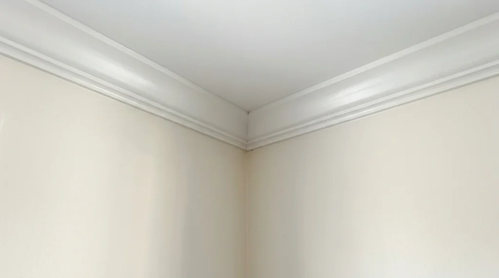
Trim gives you three common options. You can use a slightly brighter white than the walls for a soft contrast, the same color in a higher sheen for a quiet look, or a deliberate contrast color for a bolder result. Ceilings are often painted a bright white in a flat finish, which can look cleaner than matching the wall color exactly. If your walls are a warm white, avoid a very cool, icy white on the trim, or the walls may look dingy beside it.
Popular Light Colors and How They Behave
The colors below are widely used and easy to find. The LRV numbers come from each manufacturer’s published color data. Brands can update their data, so confirm the number on the current chip before you buy.
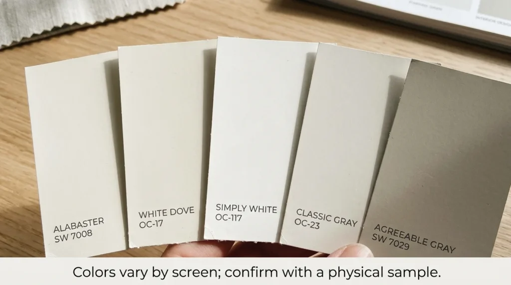
| Color | Brand and code | LRV | Character |
|---|---|---|---|
| Alabaster | Sherwin-Williams SW 7008 | 82 | Soft, creamy warm white |
| White Dove | Benjamin Moore OC-17 | 83 | Soft white with a gentle warm cast |
| Simply White | Benjamin Moore OC-117 | 89.5 | Bright white with a slight hint of warmth |
| Classic Gray | Benjamin Moore OC-23 | 74 | Very light gray that can pass as an off-white |
| Agreeable Gray | Sherwin-Williams SW 7029 | 60 | Warm gray with beige in it, often called greige |
Alabaster is a soft, creamy white that suits living rooms and bedrooms where you want a calm, warm feel. Next to a crisp bright white trim, its creaminess becomes clear. White Dove has a similar lightness, with a gentle warm cast that reads softer than a stark white. Simply White is brighter than both and carries only a slight hint of warmth, which makes it a popular choice for trim and for rooms that need as much brightness as possible.
Classic Gray is so pale that Benjamin Moore describes it as a gray that can also work as an off-white. It is a good choice if you want a hint of gray without darkening the room. Agreeable Gray sits lower on the scale at 60 and reads as a warm gray with beige in it. In a south-facing room it can look closer to beige, and it can look dingy beside very icy whites, so pair it with a white that has some softness.
Room-by-Room Guidance
If you want to refresh your space without spending too much, explore these budget-friendly home decor ideas for simple ways to update your walls, furniture, and accessories.
Living Rooms
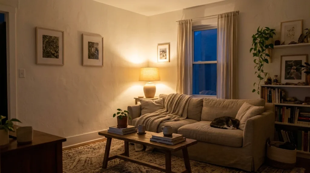
Most living rooms are used heavily in the evening, so test your samples under lamplight. Warm whites and soft greiges keep the room welcoming after the sun goes down. If your sofa and rugs have cool tones, a neutral white with no strong tint will usually work better than a creamy one.
Along with choosing the right wall color, keeping furniture and everyday items organized can make your living room feel more spacious. Check out these living room organization ideas for practical ways to create a cleaner, more welcoming space.
Kitchens
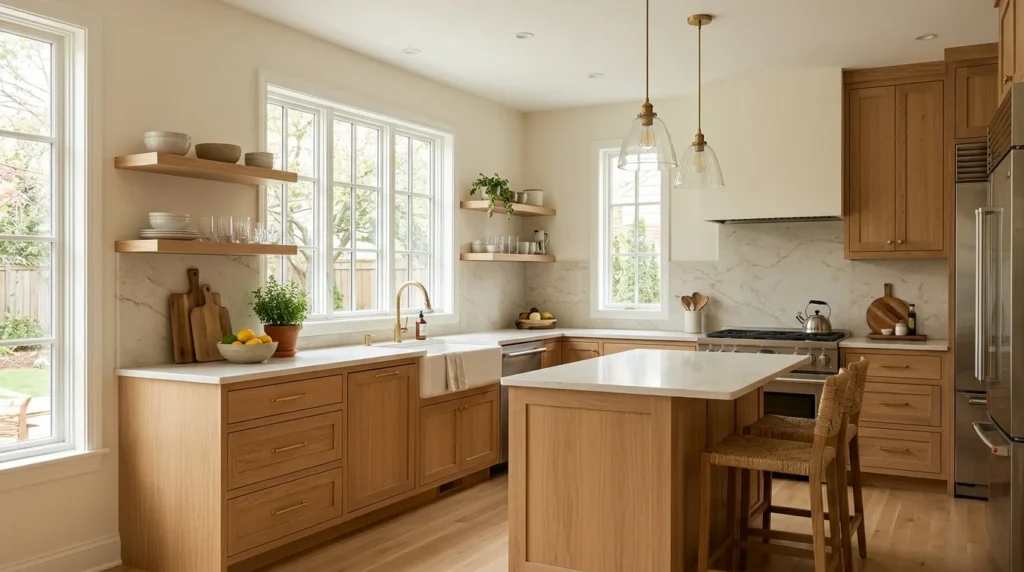
Cabinets, countertops, and backsplashes bring strong undertones into the room, so match to those first. Kitchen walls also get splashes and fingerprints, so choose a washable finish such as satin or a scrubbable eggshell.
Bedrooms
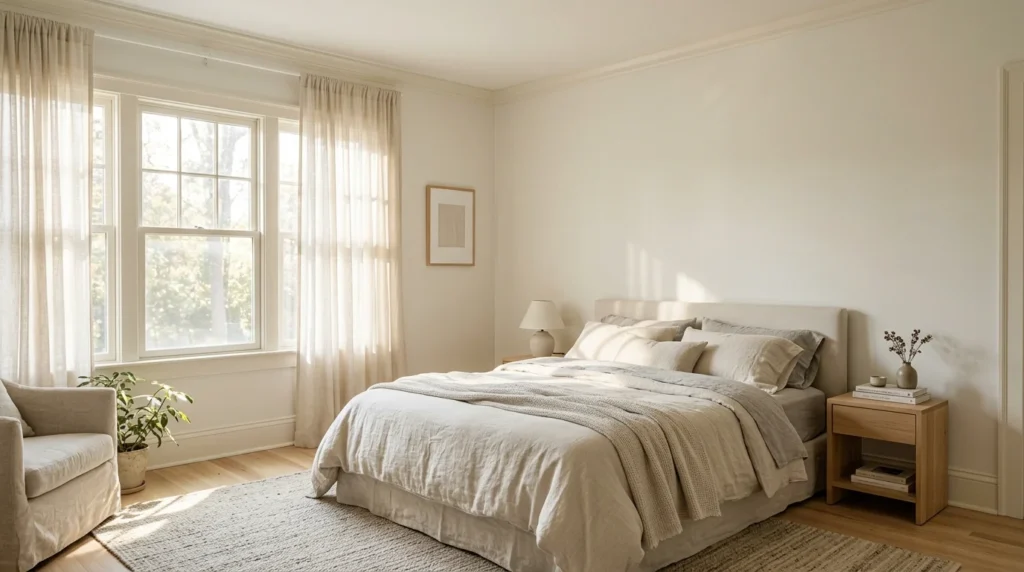
Calm is the goal in a bedroom, so softer colors with low contrast against the trim usually work well. Because bedrooms are used mostly in the early morning and at night, check how the color looks in first light and under bedside lamps.
Bathrooms
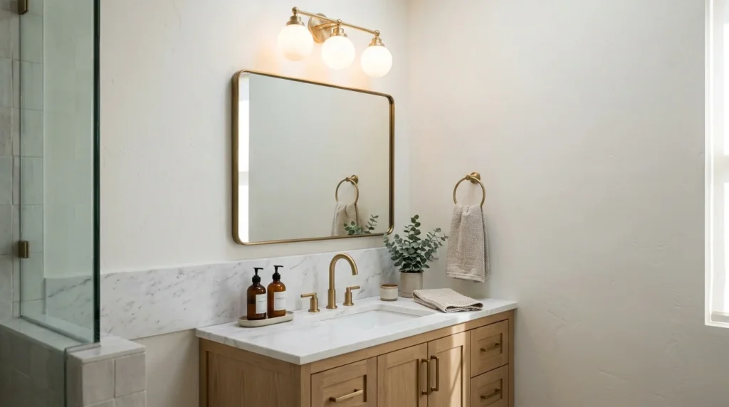
Bathrooms often have small windows and bright artificial light around the mirror, so place your sample near the vanity light before deciding. A moisture-resistant paint in satin or semi-gloss is a common choice. Good ventilation matters just as much, because steam is what causes paint to peel and mildew to grow.
Small Rooms and Hallways
Many people say light paint makes a small room look bigger. It makes a room feel brighter, but it does not change the size, and a very pale color in a windowless hallway can still look flat. Good lighting and a soft contrast between wall and trim often do more than the wall color alone.
In compact homes, choosing lighter shades is just one way to create a more open feeling. These studio apartment decor ideas can help you make better use of limited space while keeping the room bright and functional.
Choosing the Right Sheen
Sheen changes how a light color looks, because glossier finishes reflect more light and show more of the wall’s surface. Flat or matte paint hides small flaws and has a soft look, which is why it is common on ceilings and low-traffic walls. Eggshell has a faint glow and is a popular pick for living rooms and bedrooms. Satin wipes clean more easily, which suits kitchens, hallways, and kids’ rooms. Semi-gloss is the toughest of these and is often used on trim, doors, and bathroom walls.
On pale walls, higher sheens highlight dents, patched spots, and roller marks. If you want more shine, repair and sand the wall carefully first. Also test your sample in the sheen you plan to use, because the same color can look slightly different in matte than in satin.
How to Test Paint Samples the Right Way
Step-by-Step Testing Method
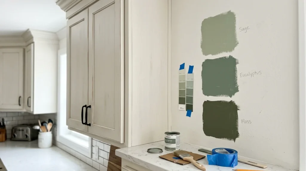
Start with sample boards or large peel-and-stick samples that measure at least 2 feet on each side. If you paint boards, apply two coats on white poster board or a primed board so the old wall color cannot interfere. Place the samples on at least two different walls, including the darkest corner and the wall that gets the most sun.
Look at the samples in the morning, at midday, and in the evening, and again under your lamps at night. Leave them up for at least two or three days, because a quick look hides shifts that a longer one reveals. Move them next to your floor, cabinets, and trim so you can see how they behave together.
Mistakes to Avoid When Sampling
The most common mistake is judging a color from a chip the size of a business card. A small patch looks different from a full wall, and large areas tend to read stronger than the chip suggests. Another mistake is painting a small square directly over a dark or colorful wall, because the surrounding color fools your eye. Finally, avoid making the final decision in the store, where the lighting is nothing like your home.
Common Mistakes When Choosing Light Paint Colors
Choosing from a photo or a screen is risky, since display settings differ from device to device and paint manufacturers themselves warn that screen colors may not match the real paint. Use online images for ideas, then confirm with physical samples.
Ignoring undertones is the next most common problem. Two light colors that look almost the same on a chip can look completely different once they cover a wall, so take the time to compare them side by side.
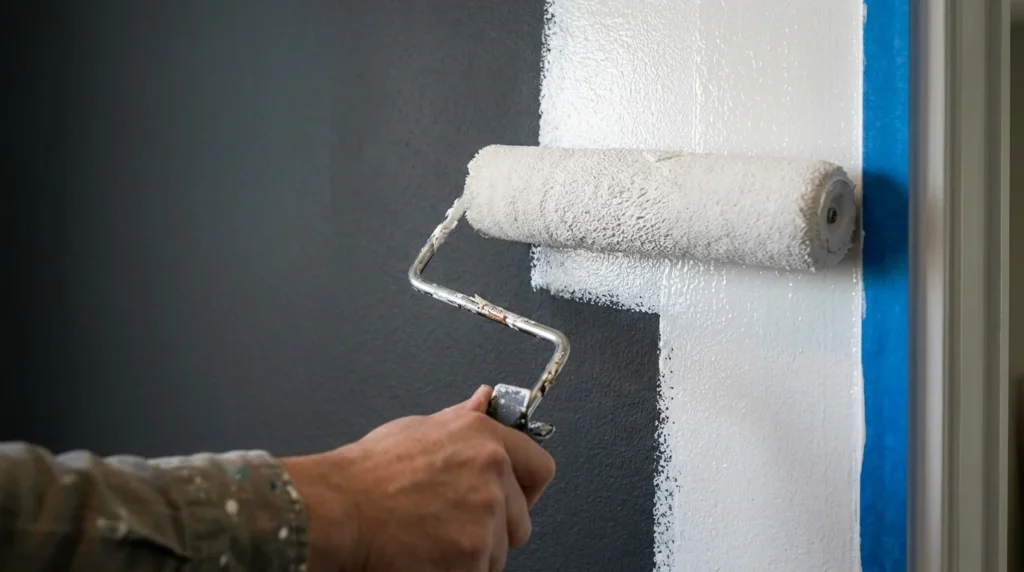
Skipping primer is another one. If you are covering a dark or strongly colored wall, light paint may need a primer and extra coats before the color looks even. Assuming that white is the safe choice is also a trap, since whites have more undertone variety than almost any other color family. Last, remember that light changes within a single room, so a corner far from the window can look very different from the wall beside it.
Frequently Asked Questions
Do light colors make a room look bigger?
They make a room feel brighter, and brighter rooms often feel more open. They do not change the actual size of the space, and they cannot replace good lighting. In a small room with few windows, the right bulbs and a clear layout will help as much as the paint.
What is the best light paint color for a room with little natural light?
A warm-leaning light color with a fairly high LRV is usually the safest starting point, because cool grays can look dull without strong daylight. Add layered lighting, such as ceiling light plus lamps, and test your samples at several times of day before you decide.
Should the ceiling be the same color as the walls?
It does not have to be. A bright white ceiling in a flat finish is the most common choice and helps the room feel crisp. Painting the ceiling the same color as the walls can work in rooms with sloped or uneven ceilings, or when you want a softer, wrapped-in look.
How many coats of light paint do I need?
Two coats is the usual amount when you paint over a similar color. Going from a dark color to a light one normally calls for primer and sometimes an extra coat. Pale colors carry little pigment, so they can look uneven after one coat, especially over a strong existing color.
How do I know if a gray is too cool for my room?
Hold the sample against a sheet of white paper and next to your floor and cabinets, using the lighting you actually have. If you see a blue or violet tint, or if the gray makes warm wood look orange or dull, it is leaning too cool. Try a warmer gray from the same brand and compare the two side by side.
Final Thoughts
Light paint colors are forgiving in one way and demanding in another. They brighten a room, but they reveal every undertone and lighting change along the way. The reliable path is to check the light in your room, read the undertone, compare it with your fixed elements, and test large samples for a few days before you buy. Pick two or three candidates this week, put them on the wall, and look at them morning, noon, and night. If you still feel unsure after that, a professional painter or color consultant can look at your actual room and help you make the final call.





Leave a Reply