

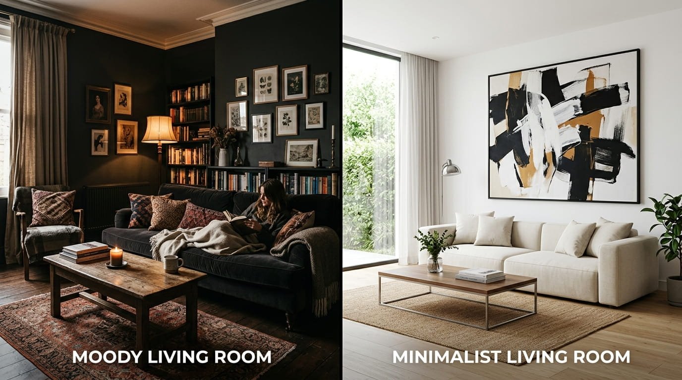
A blank wall is wasted potential, but choosing the wrong art style can throw off an entire room’s balance. You’ve probably seen it happen: a stunning piece of large wall art that looks amazing online but feels “off” in your space. The issue usually has nothing to do with the artwork’s quality. It’s a mismatch between the artwork’s style and the room’s lighting, furniture, and overall vibe.
This guide solves that problem by contrasting two of the most popular aesthetics in modern homes: moody interior design and minimalist wall art. One creates a dramatic, cozy atmosphere with rich tones and layered textures. The other brings calm, airy serenity through clean lines and neutral palettes. By the end, you’ll know exactly which style fits your home and how to place large wall art so it transforms your space faster than replacing furniture ever could.
Style Breakdown: Moody vs. Minimalist Wall Art Decor
The Moody Aesthetic (Rich, Dramatic, Evocative)
Moody wall art leans into depth and emotion. Think dark landscapes, cinematic photography, vintage oil print reproductions, and abstract pieces with heavy texture.
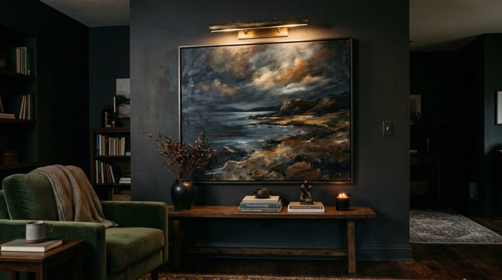
Key characteristics:
- Deep color palettes: charcoal, forest green, deep burgundy, navy, and blackened neutrals
- Textured layers that catch light from different angles
- A sense of intimacy and luxury, almost like a boutique hotel or classic library
Spatial vibe: Grounded, warm, and enveloping. Moody art works especially well in rooms where you want to feel cocooned, like bedrooms, dining rooms, and evening-focused living spaces.
The Minimalist Aesthetic (Clean, Intentional, Serene)
Minimalist wall art decor strips away excess. It focuses on intention, negative space, and subtle texture rather than bold patterns or saturated color.
Key characteristics:
- Monochromatic tones: whites, beiges, soft grays, muted earth tones
- Subtle line art, soft geometric shapes, and plaster-like textures
- Large areas of negative space that let the eye rest
Spatial vibe: Light, spacious, and calming. Minimalist pieces shine in sunlit living rooms, open-plan areas, and spaces where you want to feel uncluttered and focused. Combining these artwork choices with general minimalist home organization tips helps maintain an open, peaceful feel throughout your home.
Quick Self-Assessment: Which Wall Art Style Fits Your Vibe?
Use this 3-question checklist to route yourself to the right style. Be honest about your actual space, not your dream Pinterest board.
1. What lighting dominates your room?
- Mostly dim or warm ambient lighting (lamps, sconces, few windows) → leans Moody
- Bright natural daylight or strong overhead lighting → leans Minimalist
2. What palette dominates your current furniture?
- Rich woods (walnut, mahogany), velvets, leather, jewel-toned upholstery → leans Moody
- Light oak, white linen, bouclé, matte black metal, stone → leans Minimalist
3. How do you want the room to feel?
- Enveloping, dramatic, cozy → Moody
- Open, peaceful, clutter-free → Minimalist
Scoring guide:
- Mostly Moody answers → jump to the “Styling Moody Large Wall Art” section.
- Mostly Minimalist answers → jump to the “Styling Minimalist Large Wall Art Decor” section.
- Mixed answers → you can blend both styles in different rooms, or use one dominant style with subtle accents from the other.
Deep Dive: Styling Moody Large Wall Art
Lighting Requirements for Dark Artwork
Dark artwork can disappear in poorly lit corners. The goal is to make your moody pieces glow, not vanish.
Practical lighting tips:
- Layer your light. Combine ambient lighting (ceiling fixtures) with task lighting (picture lights, sconces) and accent lighting (directional spotlights).
- Use warm bulbs. Aim for 2700K–3000K color temperature to enhance rich tones without making them look muddy.
- Angle matters. Position picture lights or track heads so they graze the canvas at a 30-degree angle. This brings out texture and prevents harsh glare.
- Avoid single overhead lights. A lone ceiling fixture often casts shadows that flatten dark art. Add at least one wall-mounted or floor lamp nearby.
If your room is naturally dim, consider a large piece with some lighter elements (a soft horizon line, subtle highlights) so it doesn’t feel like a black hole on the wall.
Color Schemes & Furniture Matchups
Moody art thrives alongside equally rich materials. The goal is harmony, not competition.
| Moody Art Style | Ideal Furniture Finishes |
| Dark landscapes / abstracts | Leather sofas, dark walnut tables, brass accents, jewel-toned upholstery (emerald, sapphire, burgundy) |
| Cinematic photography | Black metal frames, smoked glass side tables, charcoal or slate upholstery |
| Vintage oil reproductions | Traditional wood tones, carved details, warm gold or antique bronze frames |
Styling tip: If your furniture is lighter (blonde wood, gray fabric), ground the look with darker accessories: a charcoal throw, a deep rug, or a set of black picture frames. This creates a bridge between the art and the room.
Framing & Display Tips
Framing can make or break a moody piece.
- Dark wood frames (espresso, walnut) add warmth and depth.
- Antique gold or bronze trim introduces a touch of old-world luxury.
- Deep gallery wraps (1.5–2 inches thick) create a shadow line that makes the canvas feel substantial.
Avoid ultra-thin, light-colored frames with dark art unless you’re intentionally going for high contrast. In most cases, a heavier frame anchors the piece and keeps it from looking floating and disconnected.
Deep Dive: Styling Minimalist Large Wall Art Decor
Harnessing Light & Negative Space
Minimalist wall art decor relies on light and breathing room. The goal is to make the piece feel intentional, not empty.
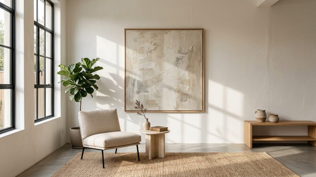
How to maximize impact:
- Use oversized matting. A wide white or beige mat (3–4 inches or more) makes small rooms look larger and gives the eye a place to rest.
- Position near windows. Sunlight enhances subtle textures in plaster-style canvases and line art.
- Keep surrounding walls simple. Avoid clustering too many pieces nearby. Let one large minimalist work stand alone as a focal point.
In open-plan living areas, a single oversized neutral canvas can define a zone (like a seating area) without visually cluttering the space.
Color Schemes & Furniture Matchups
Minimalist art pairs best with clean, natural materials and restrained palettes.
| Minimalist Art Style | Ideal Furniture Finishes |
| Textured neutral canvases | Bleached oak, white linen, travertine stone, matte black metal highlights |
| Soft geometric line art | Light wood tables, bouclé chairs, brushed nickel or chrome accents |
| Monochromatic photography | White or light gray sofas, simple black frames, minimal hardware |
Styling tip: If your room feels too cold, warm it up with natural textures: a jute rug, a light wood sideboard, or a woven wall hanging nearby. This keeps the minimalist vibe from tipping into sterile.
Framing & Display Tips
Minimalist framing should disappear, not compete.
- Ultra-thin maple or natural oak float frames keep the focus on the artwork.
- Simple frameless stretched canvases work well for textured neutrals and abstract pieces.
- White or light gray mats enhance the sense of space and light.
Avoid ornate, dark, or heavily detailed frames with minimalist art. They fight the clean aesthetic and make the piece feel busy.
How to Measure Your Wall (Simple 5-Minute Method)
Before you buy, measure properly. Doing this helps you avoid the classic sizing and placement errors that many buyers run into.
- Measure the furniture width (sofa, bed, console) that the art will hang above.
- Calculate 60–75% of that width. This is your target art width range. For example, an 84-inch sofa pairs best with art between 50 and 63 inches wide.
- Mark the width on the wall with painter’s tape. Step back and live with it for a day.
- Measure height. For a single large piece above furniture, aim for a height that fills about one-third to one-half of the wall space between the furniture top and the ceiling.
- Adjust for room feel. If the room is very tall (9+ foot ceilings), lean toward the larger end of your range. In lower ceilings (8 feet), stay closer to 60% to avoid overwhelming the space.
This quick method ensures your large wall art feels proportional, not random.
Room-by-Room Application Guide
Living Room Accent Walls
The living room is where large wall art makes the biggest statement.
- Above the sofa: Above the sofa: Follow the 60–75% width rule. Hang the piece so the bottom edge is 6–10 inches above the sofa back. Just like when you how to organize your living room, keeping visual proportions balanced prevents the space from feeling cluttered.
- On an empty accent wall: Use the same 60–75% rule relative to the wall width, or go slightly larger (up to 80%) if the wall is very wide and unbroken.
- Moody vs. minimalist choice:
- Evening-focused living rooms (movie nights, cocktails) → lean moody.
- Daytime-focused, open-plan living rooms → lean minimalist.
Master Bedrooms
Your bedroom should support rest, so choose accordingly.
- Over the headboard: A large moody piece (dark landscape, abstract) creates a cozy, hotel-like feel. Pair with warm sconces on either side.
- For a calm sleep environment: A minimalist neutral canvas or soft line art keeps the space serene. If you are also focused on organizing a small bedroom, avoid overly stimulating or high-contrast pieces directly in your line of sight from the bed. Avoid overly stimulating or high-contrast pieces directly in your line of sight from the bed.
- Height: Hang the center of the art at 57–60 inches from the floor, or 8–12 inches above the headboard, whichever feels more balanced.
Dining Rooms & Entryways
These transitional spaces benefit from bold choices.
- Dining rooms: A large moody piece above a sideboard or buffet adds drama to dinner parties. Ensure it’s at least 12 inches narrower than the furniture below to avoid a cramped look.
- Entryways: First impressions matter. A minimalist piece with light tones can make a small foyer feel larger. A moody piece with a picture light creates an instant “wow” moment if your entry is already dark and dramatic.
Placement & Proportion Rules (Avoid Common Mistakes)
Getting size and height right is more important than the actual image. Here are the non-negotiable rules.
The 60–75% Width Rule
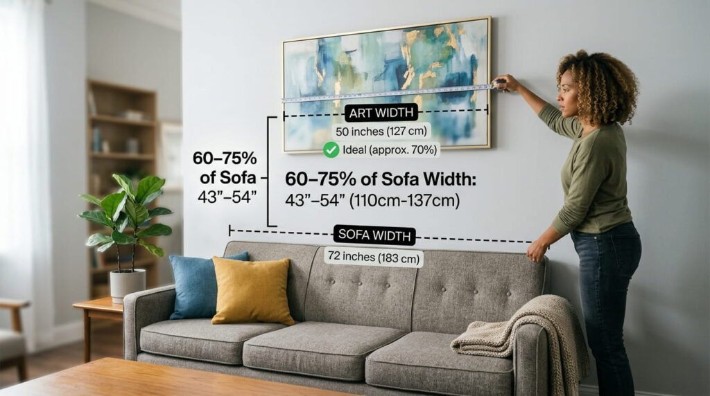
Artwork above furniture should fill 60% to 75% of the furniture’s width.
- 72-inch sofa → 43–54 inches wide art
- 84-inch sofa → 50–63 inches wide art
- 60-inch console → 36–45 inches wide art
This range keeps the piece anchored without looking tiny or overwhelming.
Eye-Level Hanging Standard
The center of your artwork should sit at 57–60 inches from the floor in most rooms.
Exceptions:
- Above a sofa or bed: 6–10 inches above the furniture top, regardless of the 57-inch rule.
- Dining rooms: Slightly lower, around 54–57 inches, so seated guests can enjoy the art.
- Stairwells and high ceilings: Follow a consistent visual line rather than strict eye level.
Frame vs. Canvas Weight: Anchor Safety
Large, heavy pieces need proper hardware.
- Canvases under 20 pounds: Standard picture hooks with two nails are usually sufficient.
- Heavier framed pieces (20–40+ pounds): Use wall anchors or screw directly into studs. D-ring hangers with braided wire distribute weight better than a single hook.
- Drywall vs. plaster: In older homes with plaster walls, pre-drill to avoid cracking. In drywall, use anchors rated for at least 1.5 times the artwork’s weight.
When in doubt, over-engineer the hanging hardware. A fallen piece can damage both the art and the wall.
Budget vs. Splurge: Where to Spend (and Where to Save)
Not all wall art needs to cost a fortune. Here’s how to allocate your budget wisely.
Worth splurging on:
- Large canvases you’ll keep for years. Higher-quality prints and thicker stretcher bars last longer and look more substantial.
- Custom framing for statement pieces. A well-chosen frame elevates even a modest print.
- Original or limited-edition works for rooms you use daily (living room, primary bedroom).
Safe places to save:
- Trend-driven pieces you might rotate every few years.
- Rental-friendly options like poster prints in affordable frames or peel-and-stick canvas alternatives.
- Secondary spaces like guest bedrooms, hallways, or home offices where guests spend less time.
A good rule: spend more on pieces you see every day, less on decorative accents in low-traffic areas.
FAQ: Large Wall Art (People Also Ask)
What size wall art works best over a sofa?
As a general rule, your artwork should cover roughly 60–75% of your sofa’s total width — so if you’ve got an 84-inch sofa, you’re looking at pieces somewhere in the 50 to 63-inch range. For the best visual balance, leave a gap of about 6–10 inches between the top of the sofa back and the bottom edge of the frame.
How high should you hang large wall art?
As a general rule, aim for the artwork’s midpoint to fall somewhere between 57 and 60 inches off the ground, which lines up with average eye level in most living spaces. If you’re hanging a piece above a sofa, console, or other furniture, though, don’t get too hung up on that eye-level number. Instead, leave a gap of roughly 6 to 10 inches between the top of the furniture and the bottom edge of the frame. This creates a more balanced, connected look than forcing a fixed height measurement.
Does dark wall art make a room look smaller?
Not necessarily. Dark artwork tends to add a cozy, intimate feel rather than actually shrinking the perceived size of a room. The key is balancing it out: use proper lighting, like picture lights or wall sconces, and pair darker pieces with lighter walls or furniture nearby. This combination keeps the room feeling open instead of closed in.
Can I mix moody and minimalist wall art in the same home?
Yes. Many homes use moody art in evening spaces (bedrooms, dining rooms) and minimalist pieces in daytime areas (living rooms, home offices). Keep framing and color tones somewhat consistent to maintain flow.
How do you know if a piece of art is too big for your wall?
A good rule of thumb: if there’s less than 6 to 8 inches of open wall showing on either side once the piece is centered, it’s probably oversized for that space. Before you commit, try using painter’s tape to trace the outline of the artwork directly on the wall. Leave it up for a day or so and see how it feels as you move through the room, this trial run often reveals sizing issues you wouldn’t catch just by eyeballing it.
What’s the simplest way to hang large wall art without putting holes or damage in your walls?
For renters, consider high-quality adhesive hooks rated for the artwork’s weight, or use a rail system that distributes weight across multiple points. Always check weight limits and wall type (painted drywall vs. textured).
Conclusion
Choosing between moody and minimalist large wall art comes down to three things: your room’s lighting, your furniture materials, and how you want the space to feel. Moody art creates drama and intimacy with deep tones and rich textures. Minimalist wall art decor brings calm and openness through clean lines and neutral palettes.


Leave a Reply